Wednesday, 12 June 2013
Shape Tween
This simple animation shows 2 shapes blending into each other
first u start with a circle then instert a key frame and insert a square and there you have your shape tween.

Monday, 11 March 2013
I started of with a mind map of different ideas assosiated with my chosen food product words i could use or images i could make from it deciding wether to make my animation linked to the food product or creating something that has nothing to do with the product
the idea of the animation was effective because i was able to create a creative animation out of one tea bag.
i first cut a slit it the tea bag and began the to capture i then poured the inside of the tea bag out and began to make a figure of a person i also used text in this animation to make it look more effective i did enjoy using these techniques because it was simple to to but looked effective
at first it was difficult because trying to get the image to look right and trying to capture the photo in the exact same spot
i would not mind working with i motion again but i would take more time to come up with a better idea
Thursday, 31 January 2013
With this animation i first designed my first idea in my book my idea was a collage of different colours my food product was seads so i made a face out of my product after creating my design in my book i then had to make it on a larger scale i gathered all the paper and equipment i needed to make my design on a larger scale i planned it out first then recorded it
for this i used sugar paper and pink and white pastels
i started but ripping parts of different coloured sugar paper and overlapping them on top of black sugar paper i then began to draw over the paper with pink and white pastel
for this animation i used time laps this took photos at a very fast paste. i liked using time laps because it was easier to use then i motion manual because i didn't have to stop every second to take the photo it did it automatically which was much simple and looked much better and more professional
i would like to work with i motion time laps again because the outcome is much more effective and looks good visually
i think if i could redo this again i would try and do a more detailed drawing and use more materials and equipment so the overall outcome turns out better
Wednesday, 23 January 2013


Monday, 19 November 2012
Lin Osbourne
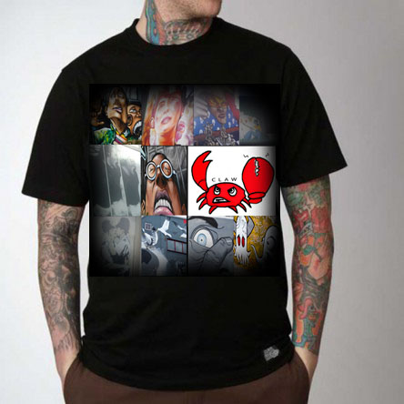
Lin Osbourne inspired t-shirt

i chose this lin osbourne t shirt out of all of the because of the colours and the way the images are layed out
I dragged all my brighton photos in to photoshop and made them into small squares pressing the shift button and minamizing them and arranging them how i want it to look i then made all my layers into one layer pressing cmd and "E"
My first design i put my logo in the middle and the brighton graffiti photos around my logo and then put the image on the t shirt

the second t shirt i used a black t shirt and re sized the logo image i made it smaller and thinner and moved the my logo in a different position then placed it on the top half of the t shirt

the third t shirt i stuck with a black one because i find the images stand out more with this t shirt i made the image bigger and placed it in the middle

The final t- shirt is placed in the middle and faded around the sides
Monday, 12 November 2012
3 coloured stencil t shirt
Stencil Design
my first coloured stencil i used a picture of the window of the brighton pavilion i chose these 3 coloured because i thought it worked well together and made the picture more bolder

my second t shirt design i used the photo of the graffiti from brighton this one i think worked better than the first because the colours go really well and i think the picture is more appealing than the first


Thursday, 25 October 2012
artist comparison
Oscar wilson comparison


Oscar wilson a callagram artist making known objects out of just words.
I started of my inspired piece by sketching a silhouette of a person holding a surfboard i then added in words to fit inside the image words that linked to my surf project then rubbed out the outline i scanned my callagram into photoshop rubbed out unwanted areas and coloured in each eachword
I think the difference between oscar Wilson's work and mine is that his work is much more organised and neat also the way the words take the shape of the image exactly whereas my callagram isn't as organised as his although you can still see what my image is.
My use of colour is different also because he uses exact colours that link to the image whereas mine is a range of many different colours.
Oscar wilson makes his callagram look realistic and have depth and form just from varying the size of his words in his callagrams which i just slightly managed to do with mine.
The words he uses in his callagram isn't just random words they link in with the image i also applied this to my work so i used surf related words like "beach, surf, waves.. ect
I find oscar wilsons work facinating because the was he manages to just use words to make such a strong image
The part i found most hardest when trying to do an oscar wilson inspired piece was trying to make my image look more 3d like his work but it was much more difficult to do
if i was to do this again i would try and make my callagram more 3D and the image would be much more detailed


si scott a typography artist
si scott makes simple text and adds curled lines and shapes around and inside the text most are brightly coloured which i think gives his work a psychedelic effect
si scotts typography looks like its done using computer based tools using something like photoshop or illustrator
I enjoy si scotts work because of his use lines and colour i like how he manages to make a really detailed image just using curls lines and circles
when doing my typography i typed out my words of my logo on illustustrator I then used the warp tool to drag down certain parts of the text then using the twirl tool i curled the edges of the text creating a swirly effect.
with my typography i mostly enjoyed the way the curls was not neatly done i liked how they looked slightly edgy.
The difference between my typography and si scotts is his work is much more detailed and well put together as mine is not so detailed which is why i prefer his to mine i like the fullness of it and the way its presented
If i was to do my typography again i would try and make it look more fuller and more professional


lin Osborne picks chosen images and collages them together in different postisions
her work involves just images and logos
This looks like it could of been done using photo shop mostly because i think the images have been colour edited and positioned on the a computer then printed on a t shirt
With all her T- shirts the images link with each other they are not just random images being put together, for example the Lin Osbourne t shirt on top is all about the beach waves and surf boards.
with my lin Osbourne inspired T-shirt i also made sure all my images all linked in together my images were all graffiti images from brighton and my logo, this was done by dragging all my brighton photos into photoshop making them into squares by holding down shift and minimising to the size i wanted it, after doing this with all my images i then arranged them into places i thought best worked then selecting all my layers and holding down cmd and "e" it became one layer i then put on a t shirt and faded the edges .
The major difference between my t shirt and lin Osbourne is her T-shirt has much more images
wich makes her t shirt look more fuller this is something i would improve if i had to do it agin
Monday, 22 October 2012
Multiple Exposure Effects
Multiple Exposure Effects


With this exposure i used the lighten tool i think this one worked well because of the blend of the pictures

This exposure i used the lighten tool i really think these two pictures worked well together because of the kids playing on the beach i think it looks ghostly.

Surf Design Callagram
Callagram T-Shirt Design
I started of by drawing out my callagram surf design on paper then re-tracing over it with out the outline

I then live traced my callagram on illustrator and coloured each individual letter with the colour swatches

After colouring my callagram I then put the image on a plain t-shirt

Thursday, 11 October 2012

Si Scott Inspired Typography
si scott black and white typography

coloured

my si scott inspired piece was done using illustrator i wanted my work to be inspired but still make it my own so the curls on my work isn't as organised as si scotts i made it slightly more edgy

This coloured version i have done on photoshop i dragged my first image and used the paint bucket to colour certain parts of the curls.

Tuesday, 9 October 2012
Vasilisa Forbes inspired piece
These are Vasilisa forbes inspired pieces these where done using photoshop
Instead of using ordinary old vintage photos the pictures i chose where all old vintage Brighton photos so they linked in with all my projects


With this the picture i chose simply colour's I thought worked well with this photo there is no particular meaning to this i just found it looked most effective to this image
Sunday, 7 October 2012
Final Logo
 With my logo I think the image worked well because its simple attractive but still appealing for my audinace of surfers I chose the colour red because it appealls to both male and female and the colour is bright and bold.
What didnt work was the tittle of the logo that I had hand drawn I decided to erase out on photoshop and use text on the computer this made my logo look more professional.
There wasn't any logo's that really inspired me.
Wednesday, 3 October 2012
Surf Logo

In this mind map I researched the names of existing surfing brands, possible target audience, surf related words and possible names for my logo this information helped me to get an idea of how my logo should be who its aimed at and the possible names it could be called.


These drawing are quick coloured sketches of different logo icons this made me think about what I would want my final logo to look like or what one of these logo icons I could improve on to use as my final outcome.

My final logo ideas I wanted my icons to be simple but attract and relate to my target audience
the first logo was aimed at kids and the last 3 was aimed at adults


These are more final design ideas these ideas are less detailed than the others and the name brands are placed outside the logo icon rather than inside like the logo's on top .


These logos were callagrams (where the writing always takes the shape of the image) this helped me decide wether I wanted my final logo to be a callagram or not.

My final logo was taken from my final ideas I chose this one because its simple but still relates to my target audience this was edited on photoshop I went round the original pencil drawn logo in black so it looked more bold then coloured red, I erased my hand drawn writing and used photoshop text I used the paint bucket tool and filled the inside with red then added details.
Subscribe to:
Posts (Atom)